 |
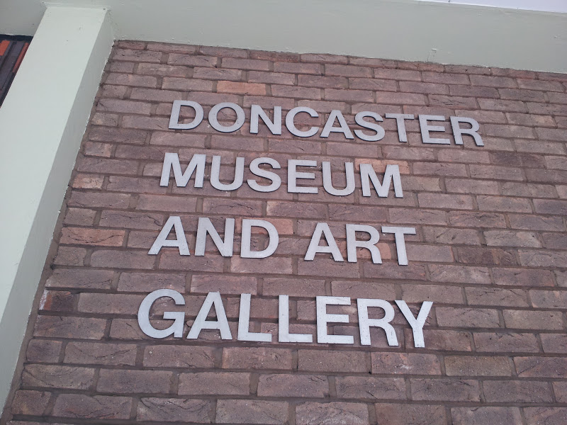
| Because nothings says museum like M-U-S-E-U-M. |
 |
| The Town Motto. |
The main building is flanked by two great big bits of modern art. On the left is a figurative sculpture by Yorkshire born teacher, writer and Apartheid era South African spy Fabio Barraclough. The rectangle represents a picture frame, and the sculpture was commissioned after a competition to create a striking piece of art comensurate with the new building.
 |
| They're holding a picture frame. |
 |
| Still holding it... |
On the right hand side of the building is 'Epicentre', an interesting abstract that reminds me of fossilised shark jaws but also evokes the white rose motif of Yorkshire. It was the work by Franta Belsky, a Czech sculptor who had an extraordinary life and career, and (amongst lots of other things) also sculpted the playful 'Mother and Baby' statue that adorns Stevenage town centre.


The external detailing of the museum is quite amazing, and the amount of work (and money) that must have gone into the tiles alone is staggering.


The interior of the museum is less interesting, being, of course, a series of large interconnected spaces, although it is rather smart and beautifully rendered – the two staircases look almost brand new. The museum itself collects a lot of interesting and varied objects and presents them well in a relatively confined area.
 |
| Donny Bears. |
 |
| Olden Days Fishing. |
 |
| Primitive people arguing, still a feature of most UK towns. |
 |
| Hungover Roman. |
 |
| Artist's Impression. |
 |
| What an Otter. |
 |
| Old Stone Face. |
There are the usual dioramas, stuffed animals, dressed up dummies and a few interactive button pressing things. As the museum has no specific theme other than Doncaster, and Doncaster has no specific identity (in terms of history, I mean – it has been used by the Romans and the Normans and played a big part in the Industrial Revolution, but is not defined by this) it can seem a bit haphazard, but it’s never boring. I’m particularly fascinated by a carved stone face which, to me, seems to resonate with ancient evil and always reminds me a bit of Peter Vaughan.
The downstairs also incorporates the Kings Own Yorkshire Light Infantry Museum, a fascinating set of displays and mannequins that culminates in a room literally wallpapered with medals. It’s been recently refurbished and is excellent.
Upstairs is the gallery part, with a fair sized permanent collection of art and pottery, and a large open space for visiting exhibitions. The effectiveness of this area is dependent on what it displays, of course, but I can report that it looked great when the Shell Travel Posters were in town (Nash, Sutherland, Dobson, McKnight Kauffer!) and equally good with about thirty Eduardo Palozzi collages hanging on its walls. The permanent collection is not to my taste particularly, but is eclectic enough to be worth looking at and there’s a Cuneo painting called ‘Giants Refreshed’ that railways enthusiasts go all unnecessary over (Doncaster is a big railway town).


What’s the best thing about it? It’s on my way to work, so I get to see it more or less every day. For me, a good museum should be like a good church, a visit to it should provide respite - a bit of peace and quiet and an opportunity to just look at interesting things and think about stuff - so I pop in whenever I have a headache and just wander around until the pain goes away.
The downstairs also incorporates the Kings Own Yorkshire Light Infantry Museum, a fascinating set of displays and mannequins that culminates in a room literally wallpapered with medals. It’s been recently refurbished and is excellent.
 |
| Gas Mask. |
 |
| Soldier vs Oik. |


